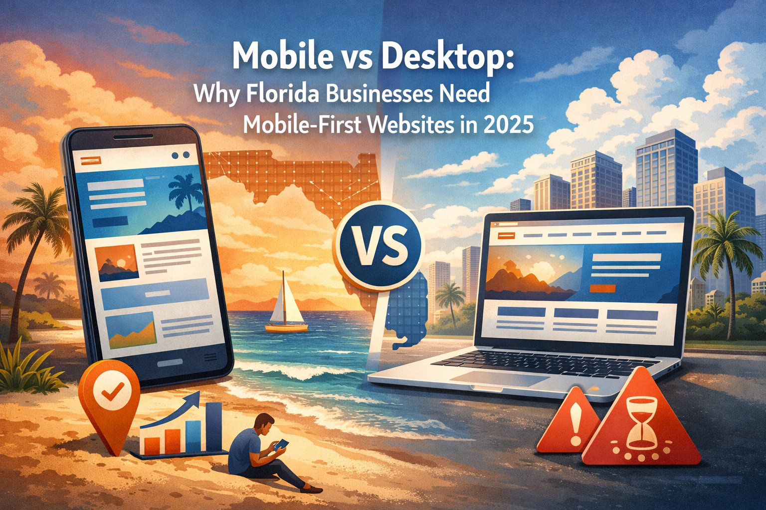
Mobile vs Desktop: Why Florida Businesses Need Mobile-First Websites in 2025
Mobile vs Desktop: Why Florida Businesses Need Mobile-First Websites in 2025
If your Florida business website doesn't work perfectly on mobile devices, you're losing customers—and money. Here's why mobile-first design is no longer optional and what you need to do about it.
The Mobile Reality in Florida
Florida has unique characteristics that make mobile optimization even more critical:
Mobile Usage Statistics:
What This Means for Your Business:
If your website doesn't work well on phones:
What is Mobile-First Design?
**Mobile-first design** means designing your website for smartphones FIRST, then adapting it for larger screens.
Old Approach (Desktop-First):
1. Design beautiful desktop website
2. Try to squeeze it onto mobile
3. End up with tiny text, hard-to-tap buttons, slow loading
4. Poor user experience
New Approach (Mobile-First):
1. Design for mobile from the start
2. Focus on essential content and actions
3. Expand layout for tablets and desktop
4. Great experience on all devices
Why It Works:
Why Mobile-First Matters for Florida Businesses
1. Google Prioritizes Mobile (Mobile-First Indexing)
What is it?
Google now uses the mobile version of your website for ranking and indexing—NOT the desktop version.
What this means:
Real Impact:
2. Florida's Tourism Economy Demands It
The Tourist Factor:
Florida attracts **130+ million visitors annually**. These tourists:
Example Scenarios:
Scenario 1: Restaurant in Miami Beach
Scenario 2: HVAC Company in Orlando
Scenario 3: Tour Company in Tampa
3. Mobile Users Behave Differently
Desktop Users:
Mobile Users:
Design Implications:
Mobile-First Requirements:
4. Mobile Conversions Are Different (But Critical)
How Mobile Users Convert:
Not through long forms or complex processes. Mobile conversions happen through:
1. **Phone Calls** - Click-to-call buttons (50% of mobile conversions)
2. **Quick Forms** - Name, phone, email only
3. **Text/WhatsApp** - Direct messaging
4. **Map Directions** - Finding your location
5. **Online Booking** - Simple scheduling
Florida-Specific Conversion Patterns:
Common Mobile Website Mistakes Florida Businesses Make
❌ Mistake #1: Tiny, Unreadable Text
The Problem:
Desktop websites often use 14-16px text. On mobile, this is too small to read without zooming.
The Fix:
Test It:
Open your website on your phone. Can you read everything easily without zooming? If not, text is too small.
❌ Mistake #2: Buttons Too Small to Tap
The Problem:
Desktop mouse pointers are precise. Fingers are not. Small buttons = frustrated users.
The Fix:
Test It:
Try tapping all buttons and links on your phone. If you mis-tap or struggle, they're too small.
❌ Mistake #3: Horizontal Scrolling
The Problem:
Content wider than phone screen forces users to scroll left-right (in addition to up-down). Extremely frustrating.
The Fix:
Test It:
Browse your entire site on phone. Should never need to scroll sideways.
❌ Mistake #4: Slow Loading Speed
The Problem:
Mobile Impact:
The Fix:
Test It:
Use [Google PageSpeed Insights](https://pagespeed.web.dev). Mobile score should be 80+.
❌ Mistake #5: Pop-ups That Cover Everything
The Problem:
Desktop pop-ups often completely cover mobile screens with no way to close them.
The Fix:
Google's Rule:
Intrusive interstitials (pop-ups) on mobile can result in ranking penalties.
❌ Mistake #6: Forms That Don't Work on Mobile
The Problem:
The Fix:
- `type="tel"` for phone numbers (shows number pad)
- `type="email"` for email (shows @ symbol)
- `type="date"` for dates (shows calendar picker)
Example: Good Mobile Form
```html
Name: [____________]
Phone: [___-___-____] ← Number keyboard shows
Email: [____________] ← Email keyboard shows
[ Get Free Quote ] ← Large button
```
How to Check If Your Website Is Mobile-Friendly
Test #1: Google Mobile-Friendly Test
1. Go to [search.google.com/test/mobile-friendly](https://search.google.com/test/mobile-friendly)
2. Enter your website URL
3. Google analyzes and gives pass/fail
What It Checks:
Test #2: Real Device Testing
Don't Just Rely on Tools - Test on Actual Phones:
1. **iPhone Test** - Safari browser
2. **Android Test** - Chrome browser
3. **Test with slow connection** - Turn off WiFi, use cellular data
4. **Test all key pages:**
- Home page
- Services/Products
- Contact page
- Forms
What to Check:
Test #3: Google PageSpeed Insights
1. Go to [pagespeed.web.dev](https://pagespeed.web.dev)
2. Enter your URL
3. Check Mobile score (should be 80+)
What It Measures:
Test #4: Search Console Mobile Usability
If you have Google Search Console:
1. Go to "Mobile Usability" report
2. See list of mobile issues
3. Fix flagged problems
Mobile-First Best Practices for Florida Businesses
✅ Essential Mobile Features
1. Click-to-Call Phone Numbers
Instead of just displaying your phone number:
```html
❌ Contact us: 321-555-0100
✅ <a href="tel:321-555-0100">📞 Call Now: 321-555-0100</a>
```
**Impact:** 50%+ of mobile users prefer calling over forms.
2. Location-Based Information
Since Florida businesses often serve specific cities:
Example:
```
📍 Serving Miami, Fort Lauderdale, West Palm Beach
🕐 Mon-Fri: 8am-6pm | Sat: 9am-5pm
[Get Directions 📍]
```
3. Simplified Navigation
Mobile menus should be:
Example Mobile Menu:
```
☰ Menu
→ Home
→ Services
→ Service Areas
→ About Us
→ Contact
→ Get Quote
```
4. Sticky Headers
Keep important elements visible:
5. Lazy Loading Images
Only load images as user scrolls:
✅ Content Prioritization
Mobile screens are small. Prioritize what matters most:
Above the Fold (Visible Without Scrolling):
1. **Who you are** - Clear headline
2. **What you do** - Brief description
3. **Where you serve** - Location/service area
4. **How to contact** - Phone number + CTA button
Example: HVAC Company Mobile Home Page
```
[LOGO] [☰]
Emergency AC Repair
Miami & Surrounding Areas
24/7 Service | Licensed & Insured
[📞 Call Now: 305-555-0100]
[Get Free Estimate →]
[Rotating 2-3 bullet points of key benefits]
✓ Same-Day Service
✓ Upfront Pricing
✓ 20+ Years Experience
```
✅ Mobile SEO Optimization
Mobile-Specific SEO Factors:
1. **Page Speed**
- Most important ranking factor for mobile
- Aim for under 3 seconds load time
2. **Mobile Usability**
- No intrusive pop-ups
- Text is readable
- Tap targets are sized properly
3. **Local SEO**
- Google Business Profile optimized
- Location keywords in content
- NAP (Name, Address, Phone) consistent
4. **Structured Data**
- LocalBusiness schema
- Include phone, address, hours
- Service areas listed
Florida-Specific Mobile SEO:
Mobile-First Design Checklist for Florida Businesses
Before Launch:
After Launch:
The Business Impact: Real Numbers
What happens when you optimize for mobile:
Case Study: Florida Restaurant
Before Mobile Optimization:
After Mobile Optimization:
Changes Made:
**Result:** $2,800/month additional revenue from mobile users
Case Study: Florida HVAC Company
Before:
After:
Changes Made:
**Result:** 4x increase in mobile leads
How to Transition to Mobile-First
If You're Building a New Website:
✅ Start with mobile design
1. Design mobile layout first
2. Optimize for touch interaction
3. Prioritize essential content
4. Then expand to tablet/desktop
5. Test thoroughly on real devices
**Timeline:** 2-4 weeks for basic site, 6-10 weeks for custom
If You Have an Existing Desktop-Only Site:
Option 1: Full Redesign (Recommended)
Option 2: Responsive Retrofit
Option 3: Separate Mobile Site
DIY vs Professional Help
When to DIY:
When to Hire Professional:
Our Recommendation:
For Florida small businesses, professional mobile-first website pays for itself within 3-6 months through increased conversions.
Common Questions About Mobile-First Design
Q: I have more desktop traffic. Should I still prioritize mobile?
A: Yes. Even if desktop traffic is higher now, mobile is growing. Plus, Google ranks based on mobile version. Future-proof your site.
Q: Is responsive design the same as mobile-first?
A: No. Responsive design adapts to screen sizes. Mobile-first is a design philosophy that starts with mobile and expands up. Mobile-first sites are responsive, but responsive sites aren't always mobile-first.
Q: How much does mobile-first design cost?
A: For Florida small businesses:
Mobile-first doesn't cost more—it's the standard in 2025.
Q: Will mobile-first hurt my desktop experience?
A: No! Mobile-first means simpler, faster, cleaner design. Desktop users benefit too. Studies show desktop conversions often increase with mobile-first design.
Q: How long does it take to see results?
A: Immediate for user experience. SEO improvements: 1-3 months as Google re-crawls and re-indexes your site.
Q: Do I need a separate mobile site?
A: No. One responsive, mobile-first website works on all devices.
Take Action: Your Mobile-First Roadmap
Week 1: Assess Current Situation
Week 2: Quick Wins
Week 3: Plan Redesign (If Needed)
Week 4: Implementation or Maintenance
The Bottom Line
In 2025, **mobile-first is not optional** for Florida businesses:
1. ✅ **65%+ of your traffic is mobile** - Don't ignore the majority
2. ✅ **Google prioritizes mobile** - Affects all your rankings
3. ✅ **Tourists rely on mobile** - Critical for Florida economy
4. ✅ **Mobile users convert differently** - Phone calls, quick forms
5. ✅ **Competition is mobile-first** - Don't fall behind
**The good news?** Making your website mobile-friendly is straightforward:
**Your next step:** Test your site right now on your phone. If you struggle to use it, so do your customers.
Need Help Going Mobile-First?
We build mobile-first websites for Florida small businesses. Every site we create:
**Free mobile audit:** We'll review your current site and show exactly what needs to improve.
Ready to stop losing mobile customers? Let's make your website work as hard as you do.


Ready to Grow Your Business Online?
Get a free consultation and discover how we can help you.
Contact Us